Sunday 25 March 2012

Live Brief!

Okay I have been given a proper Live Brief, by a cousin who has already started a clothes line but still needs a new logo or A logo, apparently its been on the to-do list for a while now, and so I took the initiative to help and offer my skills to make the final design.

Organisation:

Name: Dilkash

Business: Asian Bridal Clothing Line

Style: Elegant, Bubbly, Feminine

_______________________________________________________


So because its been on the to-do list for a long time the owner already has an idea of what she wants for a logo and what colours she wanted. 

  • Colours, It was difficult but I got her to understand the concept of using just two colours so it helps me and doesn't overcomplicate her logo and she wants  very bubbly feminine colours, when asked she said pink/blue/cyan.
  • Target Audience, when asked she obviously gave me the answer I already knew "for women" but I asked to be more specific we started going somewhere So from her experience its young (middle east/west) asian women. Its a cultural thing that asian women get married at a young age from around 19-25, and asian weddings follow a sort of theme to be bright and to have various traditional colours. So target audience is young asian women. 
  • Brand Values, when I asked her to think about her business the type of clothes with all the different colours and the style she aims for, I asked her to describe her business to me in 3 words that identify her brand values.
Values: Young, Bubbly and Elegant

  • Design, Surprisingly enough she wants her logo to be kept very simple and just stunning just have the word "Dilkash" in a fancy font inside a box. She was very specific because she wants the wedding look of it being simple so it meets a logo for a wedding. So I thought Id try it and see if I can elaborate on it to follow the conventions of the brand values.


______________________________________________________________

To be honest:

I thought it would be a very easy brief following the conventions of a wedding may mean the use of elegant colours such as cream, gold silver or even white, with a very elegant design but this brief seems to be some sort of a challenge to stay simple but yet not so simple and also bubbly. Nothings impossible I like to meet challenges and see where they take me.

Tuesday 20 March 2012

RE-TRY!!

After receiving some honest feedback yesterday about my logo I decided to start again and create a new logo possibly with a different concept for Project 2.


Feedback suggested that my logo was a bit confusing as it didn't portray the initial idea, the colour scheme was wrong along with the wrong shades and there is another Continental Tyres that have already set standards with a logo and it may seem difficult to try a use a different style when the first image when someone says "continental tyres" is of the original. 


Soooooo.. Based on this feedback I will try my best to create another logo with a good selection of colours (2 colours). Something quite simple, effective and original as it should be easy to understand. 


I look forward for attempt 2

Monday 20 February 2012

Final Image for Submission


Here is another final image I will be submitting, I think it makes a really good contrast with the trees and and has a lot going on in terms of the street and its identity, as there are many dilemmas within this particular scene you could develop. I think the colour is absolutely amazing and shows itself to be a very unique image.

Final Images I will Submit


I especially like this photo because it shows the streets of blackburn to be very distinguished and classic. I think contrasts well with the sky full of various and light healthy colours in comparison with the streets and surface where there isn't as much light, and sort of gives a sense of a false imprisonment 

Sunday 19 February 2012

Advantages/Disadvantages


Time to critically evaluate my logo and it does seem like a good logo however if I was to change something it could be the font to have slightly more bold and masculine to identify it as a organisation to ave it more bold and great, apart from this the only thing I would change would be the colour blue and maybe make it a little more lighter so it doesn't bland as much with the black and so you can make out what it looks like and slightly more clear. But I do I believe I have achieved what I set out to do and have the right brand values to define and explain my logo. 


I am confident in thinking this logo shares the same brand values of having:


Quality- with the use of smart images and Quality control (simply by the nice shade of both colours mixing well together) 


Being Advanced- with logo type and the latest font 


and showing its Reliable- with conservative colour and sunshine mixed together

Other Tyre Logos with Same Attributes

After completing my final design I ave noticed many other other logo designs that follow similar conventions to y logo but are still very much different from my logo. For instance: if we look at Michelin 

Michelin also specialises in tyres and has a very similar colour scheme to me, however hasn't really adapted the idea of using much of the yellow into the logo, however the colour scheme fits really well into the logo. This like mine is a double combination logo it consists of an image swell as the word. However this logo has kept an identity of the Michelin man with the Michelin photo where as mine identifies Tyres as a new concept for anyone who actually doesn't know who it belongs to. In this case I think my logo would be a better logo because it has a tyre to convey what its for and has the word "tyres" in it to hit the consumer and make them automatically realise that this has relations to a tyre organisation/brand.


I also noticed Kwik Fit using a similar colour scheme to me, or myself using a similar colour scheme and logo design to kwik fit, it is a really strong and good logo design due to the fact that it is slightly in italics and therefore speeds showing it really is quick to fit however it shares the same problem that the Michelin logo has there is no identity of a tyre or much to do with a tyre because kwik fit is national foreigners wouldn't be able to identify kwik fit as easily as they would be able to identify Continental Tyres or work out the fact that this is somewhat of a car place with car parts and must be car traders. This is the reason why I am putting my logo ahead of everyone else and comparing it to others.

Continental Tyres 2

After doing a little research I have come known that there are also another company called Continental Tyres. Its just something I typed in Google. It was a huge relief to find that it had nothing to do with or looked anything like the Continental Tyres I was trying to Portray. 


Here is the Continental Tyre logo, this is a very different unusual logo in compared to mine, this has a horse which shows and indicates the age of the company back when people used to use horses for means of transport, with unusual colours if you look at my logo:


Today's modern Continental Tyres you see a sudden change in style with a very different colour scheme, graphics and new sense of style which determines this goo to be more stronger, Advanced, Reliable and have the necessary quality.

Final Actual Design


Here is the final finished logo design I will produce and hand in, I especially like how the colour has been mixed together to make such a design and especially the way the words are recognised first then the wheel, It took a little time to get to the final product but I eventually got there after Just concentrating on the words and Inverting it from white to black. The yellow doesn't contrast very well with the white which is the main reason for having this logo on top of black.


Typography Design


The Typography Design, I actually really liked this design and am definitely considering to have this as my final design and logo as it looks very distinctive and mixes both colour really well with the blue having letters cut out from it showing the yellow on the bottom layer and then having the tyre mix into both colours in a very distinctive way, its like a print. 


This logo until now has made the most sense and really like the way the font is used in this particular logo, might just have this font for good now.
Everything contrasts so well n this logo, and looks like a logo with great quality, shows that its new and modern and has the colours and placement to show its reliability and how well it fits into the industry.

Another Final Image I am Deciding to Use

Another final image I am deciding to use as submission to the theme of signs and streets is an amazing picture I took with my time in Pakistan of the streets of Islamabad. 


Its not necessarily the best of quality but I thought It was fantastic the way not just this street but almost every street in Islamabad was lit with many rope lights and stalls, shops were portraying a very colourful atmosphere. 


The main reason it was like this was because days were getting close to a national holiday which celebrates the birth of the Prophet Muhammed (PBUH), the holiday is called Eid- Milad Un Nabi and is celebrated with an unusual sense of style over there with all the streets very well lit up and so many decorations and pieces put up.

Previous Post with Change

Here is the logo from the previous post, the only thing I have changed or amended is the font, as its added a lot more attitude and shows a sense of being a lot more new modern and with todays times. Its starting to look better and give me more ideas as to what I have to do.

Another Actual Design


This is from design 1 the first actual design I did on paper and looks much more modern and realistic in comparison with the other design in the previous post it conveys the right meaning by having the font and words at the front to read before recognising the tyre behind the background.

Actual Design


Here is an actual Design I attempted from Design 2, from the design it looked much more different and made a lot more sense, it still shows a sense of identity by having the words at the back of the tyre but does show any signs of modernisation or being "Advanced", should I forget about designs on paper or carry on to see what others may look like?

Design (3)

I know I haven't been able to draw the perfect wheel, or anything close to a car tyre, alloy or even a wheel, which is I based this design sheet in trying to perfect the tyre (slash) alloy so that I or We have a better glimpse of what is expected and an understanding of where to go from here:


Bear in mind the sketches are rough and will hopefully improve and look better when I actually start looking at various designs and playing around with softwares such as Adobe Photoshop and Adobe Illustrator. I feel a lot more confident in playing around and making a design on a program rather than having to make designs for it before hand this way I can experiment better and build the image in my head before going ahead with whatever I need to do. 

Interesting Image with Sign


I found this Image on my computer and really liked how the sign, street and objects around on the street has processed really well with soft lighting considering the various number of factors such as the different coloured cars and home doors. You can tell I didn't apply any particular filters to this image mainly because of the car rushing down and a corner house with their lights on at the top left, this image has created and set practically its own mood and I find this piece really interesting to look at.

Camera Positions

I think its important to look at what perspective the audience need to look at from what view and angle the audience need to recognise the logo and how much more appealing can the logo be from a slightly different perspective. Here are some angles I drew and took note of with interesting notes/annotations alongside to show how interesting the shots can be:

(Please Note: When Im talking about Camera's and the position, I mean the Audience/Consumers point of view and from which perspective they should view the product) 


In the end I decided to have a normal standard forward facing camera (perspective) mainly because there isn't much point of making something if the consumers are not able to understand the product, and a logo should ideally be kept simple for everyone else to understand and not be so overcomplicated.

One of My Final Images

Here is one of the final images, I will present to the theme signs and streets. 


I think this is a great image to present as it has many different and unusual sense of direction with red signs showing you can't turn left or right with level crossing lights at both sides. 


I really like this image because every time I look at it it gives a good contrast over everything thats green in the image and everything thats red, and contrasts well together because Green symbolises healthy, life, eco. Where as Red symbolises Danger, unhealthy, blood etc. 


The reason why everything contrasts so well was because of me extending the shutter speed and changing the aperture allowing more light into the camera and illuminating the picture as cars and various objects go past. I like everything about this picture including the direction of the lamps etc.

Designs (2)

Here is another set of designs quite different from the Design sheet one it has some different and intriguing designs, something much different and unique, hopefully something along the lines of Continental Tyres.


Design 3: Has the background black with the word Continental and a tyre at the end zooming of, the word Continental Tyres and the tyres will both have a mixture of blue and yellow in them.


Design 4: The typography design, by looking through some of the lecture handouts and just simply by looking the letters, I though it would be interesting to make a design and include a tyre/wheel/alloy as the letter "O" in Continental, that way its a lot more interesting and changes the content.

Designs (1)

Here are a few designs/sketches I've been working on recently, just to show what sort of Ideas have been processing and what I want the outcome to be, Im not the best at Art but I have annotated the design to give a better explanation of the Designs.


Design 1: Shows the brand name, with a tyre at the black for a sense that both objects merge into one I believe it gives a sort of Identity to the words and shows that its a tyre business. I also believe it would make an excellent branch sign on buildings, something unique and different.


Design 2: Shows the organisation name on top of a tyre, to give a unique sense of  identity and use the background as a tyre to convey whats in the foreground a bit like Design 1 but in a different position.

The Perfect Font!

I have been looking through various and many different fonts which may explain and define the organisation I am representing.


I need a font that suggests the organisation to be bold strong as a car/tyre masculine strong but at the same time advanced as in new and efficient. 


I started by looking for fonts on various websites that might match my brand values so I searched for fonts with names such as Quality, Reliable and even Advanced. But didn't manage to find out much.


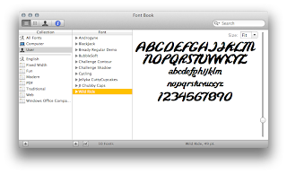
I then literally started looking through many websites and went through hundreds of pages to find the perfect font, I found myself to be very picky but also had a thought that perfection takes time, then eventually I started storing different fonts Sans and Serifs and collected various and different fonts:


These are the fonts I chose and the one I thought would be absolutely perfect was the very first one on the list "Androgyne" however I instead of using just that font I thought it would be a great idea to experiment first and see all the fonts and who knows I might change my mind later on.

Continental Tyres

I have chosen the organisation of the brand I will be representing to be Continental Tyres, solely for the purpose that it is a huge brand and they have undertaken the huge and great responsibility to provide service continentally all across UK and thats how I want to be representing this brand and how I have used my knowledge to choose the colours and brand values. 


Continental Tyres is the brand name just by listening to it just gives a feeling of how positive and confident I feel representing it. 

Landscapes

While looking at the four photos brief I had an idea to take some landscape pictures of the place where I live and then maybe zoom in and look into a specific area where I might be able to find a lot action or artistic views. 

But it turned out to be quite difficult considering the type of photos and that I took a lot of concentration on the sky rather than the the place. So might just go around and look for the signs but Its given me a good idea of where to start.


Brand Values

After considering the target audience the brand, colours and most importantly organisation. I decided to give an outline as to what or how the organisation should be represented.


I came up with many terms and words of all the different possible values my brand shares, but came up with three ultimate brand values which confirms and identifies my logo and the organisation.


They are: 


ReliableMainly because I believe there should be a trust between consumers and the organisation a sense of trust that they are Reliable and will not let anyone down through the means of service (labour) and by selling goods that will last the consumer a long time.


Quality- Quality as in the goods and items such as tyres and car parts have the necessary significance/quality to make sure the organisation prove themselves to be efficient and Reliable. My logo will show the organisation to have the quality in the organisation that provides the best parts.


Advanced- Advanced, the fancier term for new or modern. As time progresses new means of equipment and test stations enter many fields of work, I want to be able to represent the logo to show that the brand is new efficient which links with Reliable and Quality, to also give a glimpse of hygiene show that this organisation is the way forward.


Here are the three main brand values I have chosen to have in my logo.

Tuesday 14 February 2012

Tyre Designs in My Logo


I decided to include a tyre in my logo seeing as though there aren't many tyres in todays logos I decided to include one in mine, here are just a few designs of some tyres at different angles. Here are some of the angles of the tyres I am considering to include in my logo.

Colours

The two colours I have chosen to include in my logo for significant reasons:


Blue


There are many reasons why I have chosen the colour blue to have in my logo, because it is a very masculine colour as I discussed in my earlier post and want it to be suitable for the target audience, its likely the target audience would like the colour blue instead of a different colour lets say pink.


I also chose blue because I remember discussing colour values in a previous lecture saying what colour represents what, and blue may represent itself to be conservative, reliable, corporate and even confident. I suppose it does depend on the shade but thats the sort of image I want to put into peoples heads when they look at the logo to have been sold reliable tyres and conservative something thats going to last them.


Yellow


After looking through many different colour combinations to see which colour may best fit the colour blue to adapt and convey a masculine tyre company logo would be yellow because yellow is such a vibrant colour it may be represented as the colour of energy, intellect, happiness and sunshine. I thought why not add an adjective to the colour blue to constraint a positive organisation so:


Yellow= Positive (Brightness, Happiness, Energy)


Blue= Masculine (Men, Reliable, Confident)


I also like the idea of when you mix both colour together you get the colour Green. Which signifies natural, healthy and positive. "Green to Go" I like the idea that to get to green you must mix blue and yellow so with confidence and all the values blue and yellow signify you conclude with a strong and healthy green.

Target Audience

It is important to consider the target audience of the organisation for whom I will make the logo for so that I can construct a product in favour or that is best suited and recognised with the regular audience of this service.


Because it's tyre company which relates a lot to cars and in the process of fixing them or modifying them, which is why the logo will have to interact and show to be more Masculine.


I would also have to make sure to have my logo to appeal to the right age group, I think 17-40 would be ideal, mainly because from my own experience when I passed driving at 17 I remember talking with lots of friends about having all sorts of alloy wheels and tyres on a car I would buy (same for many friends same age as me).
I think the period ends at 40 though because I gathered a little research by asking my uncles and friends fathers whether they still visit a tyre shop and have a tyre changed and most men after the age of 40 give the responsibility to let someone else have it changed. That may not be the case for many people but I choose to go with the majority.


I also think the target audience would be people who have great deal of interest in cars or tuning and modifying cars this is why I plan on making a logo for this target audience, something sporty masculine of various ages.


Monday 13 February 2012

Representation

Because the brief states I can choose my own fictitious company/brand/organisation to represent and make a logo for them. 


I think this can work towards my advantage and am choosing to make a logo for a  tyre company that specialise in car tyres. There are many reasons why I am choosing a fictitious tyre company to represent, mainly because:


__


1) I have looked through many national and local tyre companies, and after looking at some of their logos I can't seem to figure whether the logo has anything to do with car tyres.


2) I also haven't seen many tyres within a tyre logo company, and thought I could make a combination mark and have at least one tyre company that have at least a tyre in their logo to convey more meaning about the company to show what they do and what they are about.


Here are some non-fictitious tyre company logos, which I think look very dull, un-appealing and unfit to be tyre company logos, just by looking at the design, the choice of colours and logo type:


Sunday 12 February 2012

Choosing Logo Type

There are many different logos out there that convey different meanings and show a sense of creative artistic flair to brand and identify its form of representation. I have looked through many logo types, and considered many different logo types for my project, here are some I've been considering to use for my project:


Brandmark:


Where the design/symbol represents the organisation in a simple but effective manner.


Wordmark:


This is where the design is a unique font designed to spell out the organisation, often used to shown sophistication of a company.


Lettermark: This is where the lettermark has the company name written out, very creative and exclusive typography, just has symbols representing the company through the means of the companies first letters.


Combination Mark: The combination mark has both words and the symbol within the logo, it is often used to show a strong combination of the company and demonstrates that many can recognise just the symbol without the use of text.


Here are some of the main logo types I have been considering in great detail, I am aware that there are many other logo types to choose from but I decided to choose a logo type that is a lot more common and something that maybe easy to recognise and easy to print and copy